Case Study · 2025

Hatch.

A modern social platform for builders — where proof of work replaces the résumé.

Client
Hatch
Role
End-to-end design partner
Scope
Product, brand, system, web
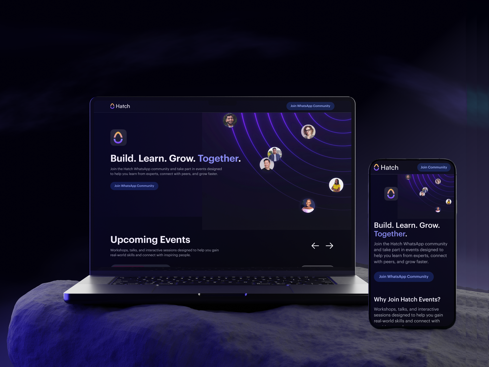
Hatch product cover

Overview

A next-gen social space for the next generation of builders.

Hatch consolidates five fragmented platforms — feed, events, community, launch, work — into one continuous loop. Discover, learn, build, ship, get found. We partnered with Hatch as their end-to-end design team to take the product from concept to launch.

5
Surfaces unified into one product
12
Weeks from kickoff to launch-ready beta
40+
Reusable design-system components
3
User personas guiding every flow

The problem

Talented people are invisible behind static résumés.

Builders juggle LinkedIn for visibility, Discord for community, Behance for portfolio, Notion for projects, and Eventbrite to learn. Their best work scatters across platforms — and rarely converts into opportunity.

73%

of students say their résumé doesn't reflect the real skills they've built. The brief was clear: replace the résumé with living, visible proof of work — and stitch the five tools they already juggle into one place.

Discovery & Research

We started by listening — to builders, students, and founders alike.

Three weeks of mixed-methods research grounded every later decision. We mapped the real journey from "I'm learning" to "I got hired" — and the seams where people fall through.

01 · Interviews "I have shipped things — I just can't prove it on a résumé."
Recruit method 1:1 chats with students, freelancers & founders. 45 min, async follow-ups.
18 participants · 45 min each
02 · Competitor scan 9 products audited — LinkedIn, Behance, Polywork, Read.cv, Lunchclub, Discord, Notion, Eventbrite, Substack.
What we found Every product owns one verb. Nobody owns the loop.
9 products · feature teardown
03 · Surveys 142 responses — quant signal on what builders do today vs. what they wish they could.
Three personas emerged The Student · The Builder · The Hirer
142 responses · 3 personas

What we learned

Four insights set the direction.

Insight 01 Visibility, not vanity. Builders don't want another social timeline. They want to be findable for the work they actually do — proof, not posts.
Insight 02 Community lives in the verb. People stay where they're actively doing — building, attending, launching. Passive groups die fast.
Insight 03 Events are the on-ramp. Live, expert-led workshops were the #1 requested feature — they convert lurkers into participants.
Insight 04 Profile = portfolio. Every interaction — a launch, a workshop attended, a comment shipped — compounds into proof of work.

Information architecture

Five surfaces, one loop.

We collapsed the journey into five primary surfaces, all reachable in one tap. Every surface feeds the next — the work you ship on Launch becomes content on Feed, proof on your Profile, and a workshop topic on Events.

proof → re-discoverable where it all compounds ↘
Surface 01 Feed
discover
Surface 02 Events
learn live
Surface 03 Community
connect
Surface 04 Launch
ship to the world
Surface 05 · The hub Profile · Work
your living portfolio.
every action compounds here.

Wireframes · Mobile

Skeletons before skin.

Hatch lives on a phone — every flow was sketched mobile-first. Three rounds of low-fi screens, scribbled in the margins with what each tap should feel like before pixels got involved.

Feed
WF-01 · Mobile
Goal One scroll. Surface what builders shipped today.
Stories rail Live workshops + drops, pinned on top.
Density rule Avatar + 1 line of context.
Never two avatars on a row.
5-tab nav Feed · Events · Launch · Inbox · You
Events
WF-02 · Mobile
Hero card LIVE pill, countdown, 1-tap RSVP.
User quote "I want to see who else is going before I commit."
LIVE
+82 going
RSVP — free
Social proof Show 3 avatars + "+82 going" — never just a number.
Friction RSVP = one tap. No modal, no calendar dance.
Community
WF-03 · Mobile
Channels list Grouped by topic. Unread = bold + dot.
Insight People stay where they're doing — show active threads, not topic counts.
Pinned
3
Design
12
Compose FAB Always reachable thumb-side. New thread in 2 taps.
Drop-off fix v2 added group icons — recall +28% in testing.
Profile · Proof of work
WF-04 · Mobile
Hero strip Avatar · name · 1-line bio · Follow.
Hypothesis If the profile = portfolio, every shipped thing belongs here automatically.
Follow
Projects
Events
Posts
Work tile Each tile = 1 launched project. Branded color from the post.
3-tab cap Projects · Events · Posts. More than 3 = decision paralysis.

Design system

Built to scale — restrained on purpose.

A single type ramp, a tight color set, and 40+ components designed for density without noise. Every token mapped to a code variable so handoff was zero-translation.

Type scale
Display
48 / 56 · 600
Headline
32 / 40 · 600
Title
18 / 24 · 500
Body — neutral state.
16 / 24 · 400
Caption · meta
13 / 18 · 500
Color tokens
Ink
#0D0D0D
Spark
#6C5CE7
Signal
#4CA9FF
Cream
#F8F7F3
Stone
#ECEBE5
Mist
#D8D6CC
Spacing scale

4 · 8 · 12 · 16 · 24 · 32 · 48 · 64 · 96

Key screens

From wireframe to product.

Final UI shipped with the brand voice fully baked in — clean, intentional, energetic. Below: the surfaces builders actually use to learn, ship, and get seen.

Hatch product screen — feed
Hatch product screen — events
Hatch product screen — community
Hatch marketing site

Process

How we worked — end to end.

Weekly sprints, async-first reviews, and a shared Figma file kept the loop tight. Engineering joined design from week one — no throw-over handoffs.

Week 1–2 Discover Workshops, interviews, competitor scan, journey maps.
Week 3–4 Define Personas, problems, IA, MVP set, success metrics.
Week 5–7 Design Wireframes, prototyping, usability tests with 12 builders, brand.
Week 8–10 Build Hi-fi UI, component library, dev handoff, marketing site.
Week 11+ Ship & evolve Beta launch, weekly iteration, ongoing design support.

Results

As Hatch's end-to-end design partner.

We delivered the complete product ecosystem — platform, brand, identity, marketing — and stayed on as the ongoing design team. The system holds up: every new feature ships in the same voice without rework.

Product UI/UX

5 surfaces, 60+ screens, end-to-end flows

Design system

Tokens, 40+ components, Figma library

Brand & identity

Logo, type, color, voice, guidelines

Marketing

Website, social, event posters, launch assets
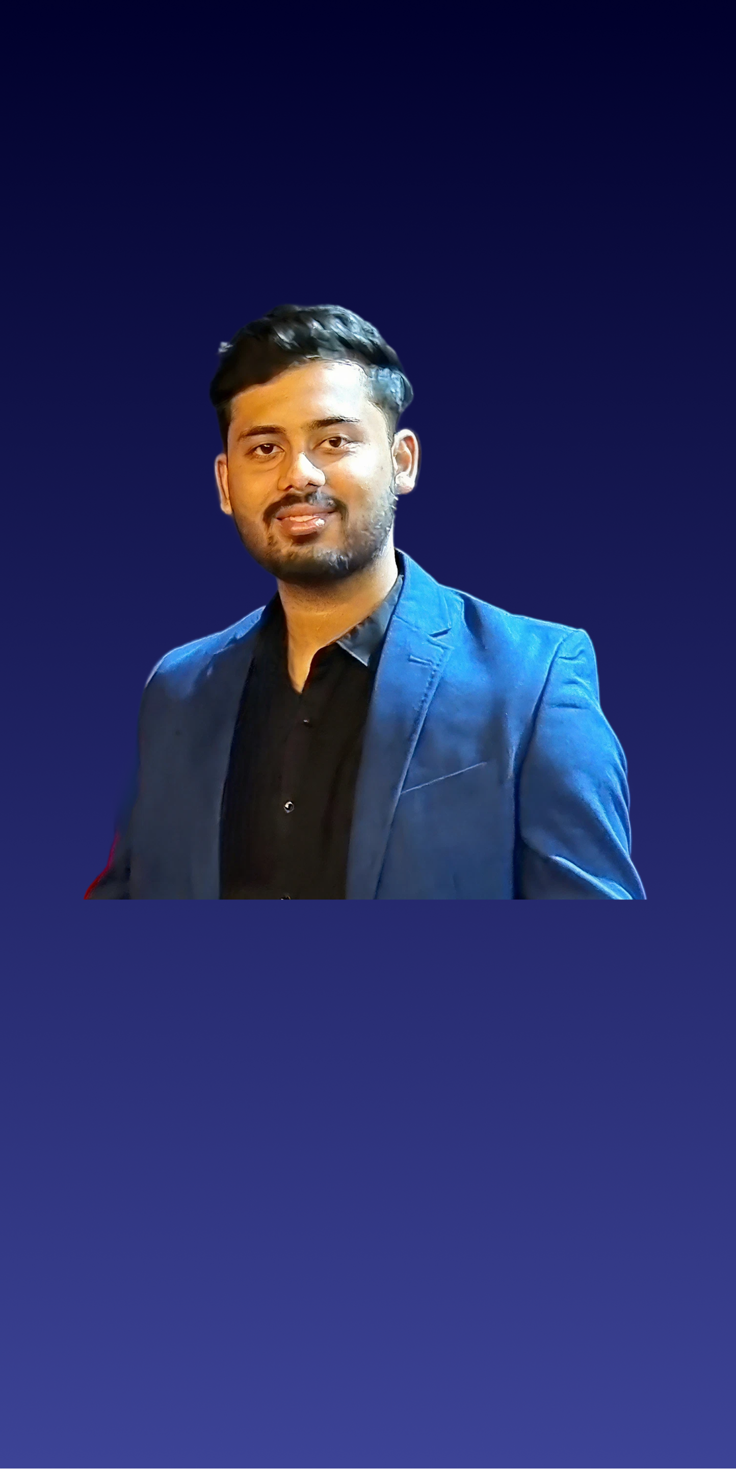
Harshdeep Kaushal, Founder & CEO of Hatch
Founder · Hatch
Working with Oli & Hue was a turning point for Hatch. They understood our product vision better than anyone. They don’t just design — they think like founders.
★ ★ ★ ★ ★
Harshdeep Kaushal
Founder & CEO · Hatch